

What is the Anti-AI Branding Aesthetic?
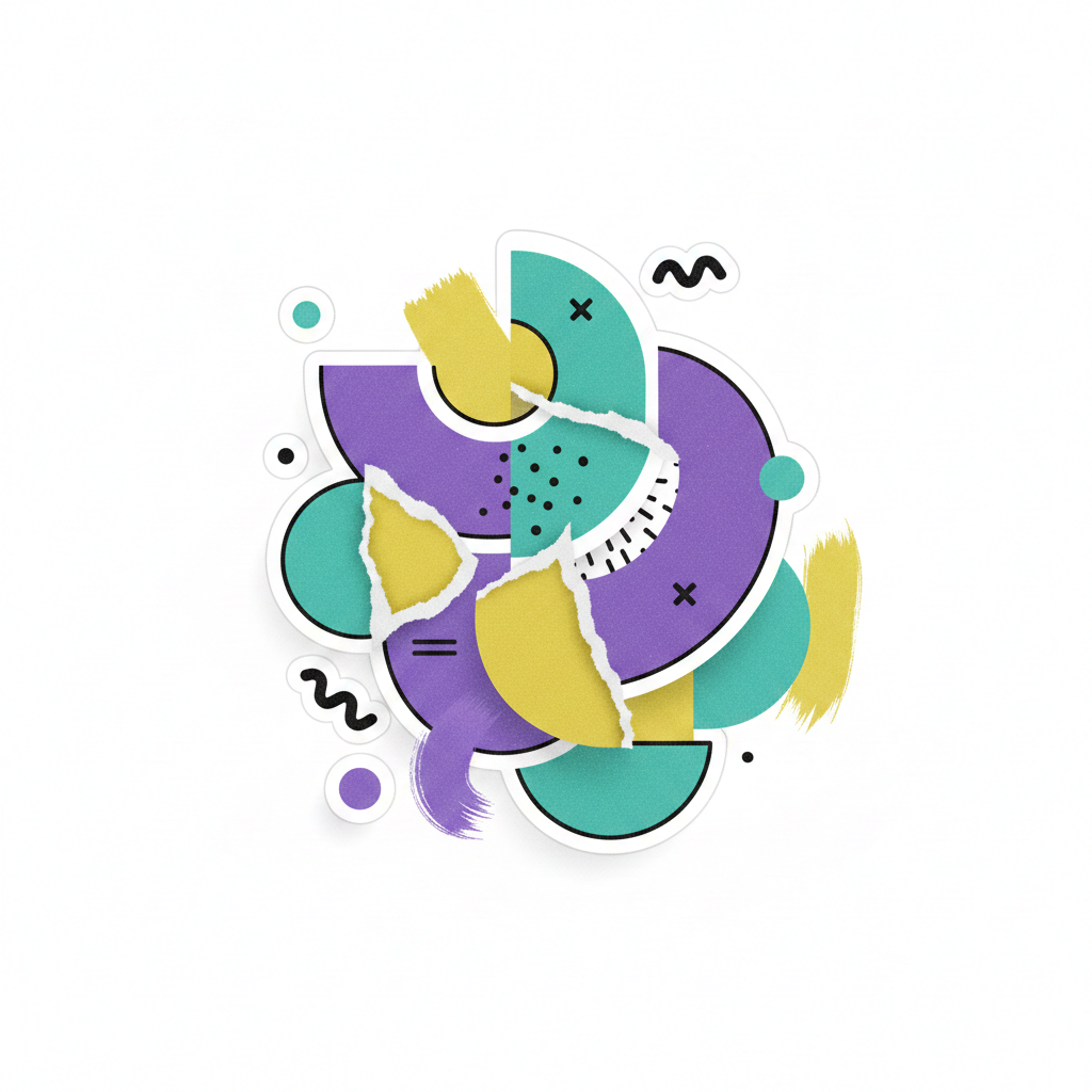
The anti-AI branding aesthetic is a deliberate design choice to embrace imperfection. It prioritizes the “hand of the artist” over the “calculation of the machine.”
While AI strives for symmetry and high-definition clarity, this aesthetic celebrates:
- Variable line weights in typography.
- Film grain and natural light in photography.
- Paper textures and tactile finishes.
- Intentional asymmetry and “happy accidents.”
It is a visual protest against the sameness of the modern internet. When every brand uses the same AI-suggested color palettes, the brand that looks “hand-drawn” is the one that captures the eye.
The Science of ‘Felt Memory’ in Branding
At the heart of this movement is a concept known as felt memory. This refers to the physical sensations we associate with past experiences—the grit of a charcoal sketch, the smell of an old book, or the slight blur of a Polaroid photo.
When a customer sees a brand utilizing an anti-AI branding aesthetic, it triggers these sensory associations. They don’t just “see” the brand; they “feel” it.
Why Felt Memory Build Trust
- Proof of Effort: AI is perceived as “instant.” Analog-style design suggests that a human spent time, energy, and thought on the creation.
- Relatability: Humans are imperfect. When a brand shows its “seams,” it feels more like a person and less like a faceless corporation.
- Nostalgia: Analog elements ground us in a physical reality that feels safer and more permanent than the fleeting nature of digital feeds.
Strategic Elements of Analog Design
You don’t have to throw away your computer to adopt an anti-AI branding aesthetic. It is about integrating specific “human” cues into your digital presence.
1. Tactile Typography
Move away from the ultra-clean, geometric sans-serif fonts that have dominated the tech industry for a decade. Instead, look for serifs with “ink traps” or custom lettering that feels like it was written with a physical pen.
2. Organic Color Palettes
AI often defaults to vibrant, neon, or perfectly balanced pastels. Analog design pulls from the earth. Think of colors found in nature: ochre, terracotta, sage, and deep indigo. These colors feel “stable” to the human eye.
3. The Use of “Noise”
Digital perfection is silent. Adding subtle grain, dust textures, or “risograph” printing effects creates a sense of depth. It tells the viewer’s brain that this object exists in a 3D world, not just on a screen.
How to Implement an Anti-AI Branding Aesthetic Without Losing Modernity
The goal isn’t to look “old-fashioned”—it’s to look real. You can still have a high-performing, modern website while maintaining a human touch.
- Photography over Generation: Use real photos of your team or your process. If you must use stock, look for images with natural shadows and unedited skin textures.
- Hand-Drawn Icons: Replace your generic, thin-line vector icons with custom, hand-sketched versions. This adds immediate personality to a UI.
- Tangible Copywriting: Match your visuals with a voice that sounds like a conversation. Avoid the repetitive, list-heavy structures that AI chatbots typically produce.
“In a world of infinite digital replicas, the original becomes the ultimate luxury.”
Breaking the Algorithm: Why This Wins in 2026
As search engines and social platforms become flooded with synthetic content, the anti-AI branding aesthetic acts as a “Trust Signal.”
Users are developing an “AI-dar”—an intuitive ability to sense when something is generated. When a user detects AI in your branding, their guard goes up. They wonder: If they didn’t put effort into their look, are they putting effort into their product?
By using analog design, you provide an immediate answer to that question. You are signaling that your brand is curated by humans, for humans. This builds an “unbreakable” bond because it is based on a shared physical reality.
The ROI of Imperfection
It might seem counterintuitive to spend more time making something look “less perfect.” However, the business results are clear:
| Feature | AI-Standard Aesthetic | Anti-AI Aesthetic |
| Consumer Connection | Low (Transactional) | High (Emotional) |
| Brand Recognition | Low (Looks like everyone else) | High (Distinctive & Unique) |
| Perceived Value | Commodity | Premium/Artisanal |
| Longevity | Follows Trends | Timeless |
Conclusion: Reclaiming the Human Element
The anti-AI branding aesthetic is more than just a trend; it is a return to the roots of communication. By leveraging felt memory and the warmth of analog design, you create a sanctuary for your customers in a cluttered digital landscape.
You don’t need to be perfect to be trusted. In fact, in the modern market, your imperfections might just be your greatest competitive advantage.