

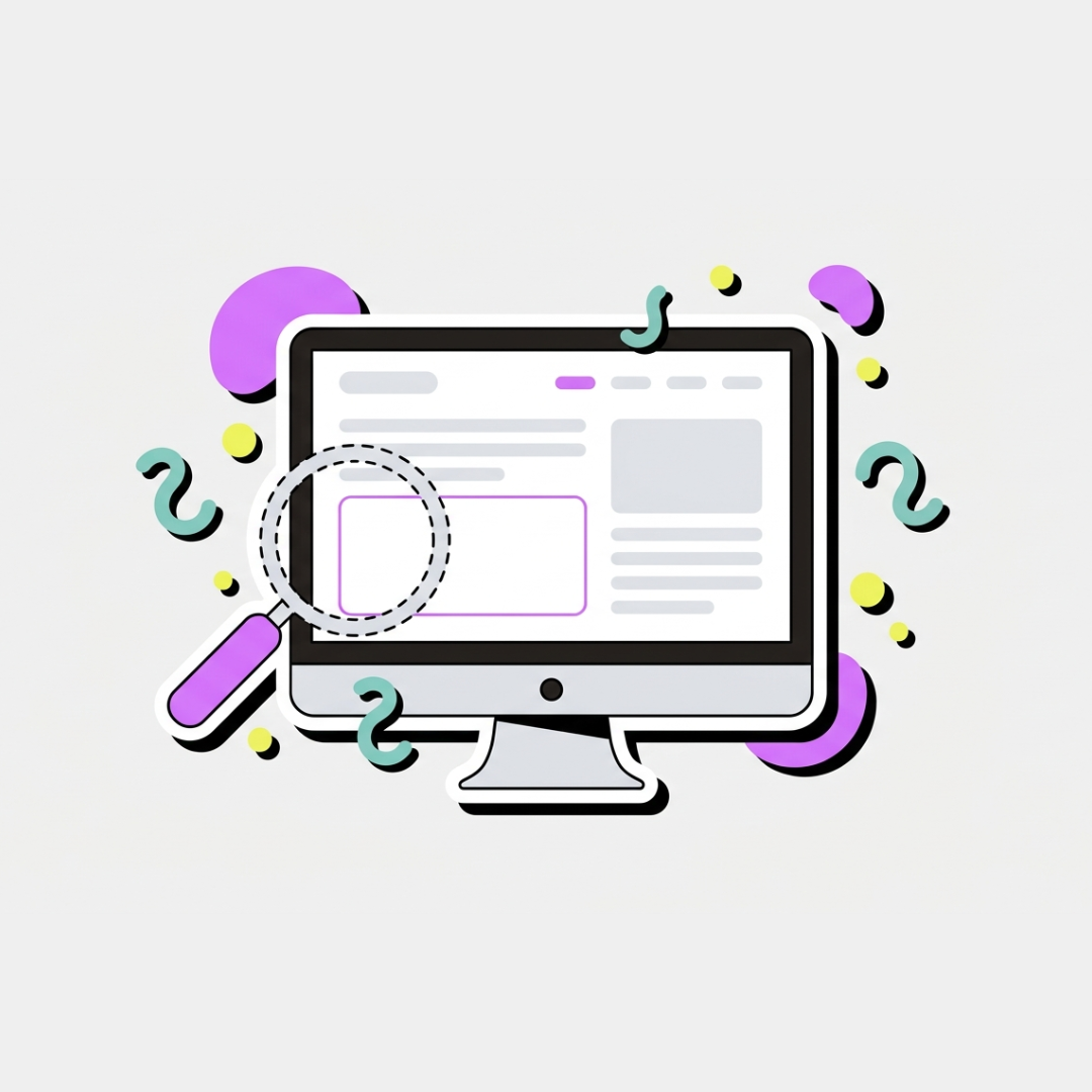
Your website looks stunning. Your designer did a great job. Your friends said ‘wow.’ And yet — your contact form hasn’t pinged in three weeks. Here’s why.
Most business owners think a stunning website is the ultimate fix for their revenue problems. You hire a designer, pick out gorgeous fonts, obsess over color palettes, and launch with a sense of pride. Then, you wait. Weeks pass, and your contact form remains completely empty.
It is a frustrating reality: having a beautiful website not getting clients is one of the most common traps in business. Aesthetics alone do not pay the bills. If your site looks like art but acts like a ghost town, you are prioritizing decoration over basic human psychology.
The truth is that your prospective clients do not care about your award-winning layout if they cannot figure out what you actually do within five seconds. Websites must be built to sell, not just to look pretty.
The Curse of Creative Vagueness
When someone lands on your site, they arrive with a specific problem. Too many beautiful websites hide the solution behind poetic headlines and confusing metaphors. If your hero section says “We Empower Synergistic Evolution,” no one knows what you are talking about.
According to a web usability study by the Nielsen Norman Group, users often leave web pages within 10 to 20 seconds unless the value proposition is incredibly clear. You need to present a clear offer immediately.
Your design should guide the eye directly to your value, not distract from it. When your layout is too busy with abstract graphics, your core message gets completely lost.
What Your Hero Section Actually Needs
- A clear header: State exactly what you do and who you do it for.
- A direct subheadline: Explain the specific mechanism of how you solve their main problem.
- A single call to action: Tell them precisely what action to take next.
Your Call to Action is Playing Hide and Seek
Another massive reason for a website not getting clients is an invisible or confusing call to action (CTA). Many premium designs tuck the “Book a Call” button away in a tiny corner to keep the interface looking clean.
If a user has to hunt for a way to work with you, they will simply leave. Your primary CTA button needs to stand out boldly against the rest of your color scheme.
Do not give people five different options on a single page, either. When you ask them to read your blog, follow your Instagram, download a freebie, and book a consultation all at once, you create decision paralysis.
You are Designing for Yourself, Not Your Target Audience
It is easy to fall into the trap of building a website that satisfies your personal aesthetic tastes. You want it to look sleek, modern, and sophisticated. However, if your target audience consists of traditional corporate executives, an ultra-trendy minimalist layout might actually alienate them.
Good UI/UX design is not about what you like; it is about what builds trust with your specific audience. Every design choice must serve the user journey.
If your navigation is overly unconventional just to look cool, you are actively introducing friction. Keep your navigation predictable so users can find your pricing, case studies, and contact details instantly.
Your Mobile Experience Is an Afterthought
Over 70% of web traffic comes from mobile. If your site looks great on desktop but breaks on a phone — squished text, tiny buttons, slow load — you’re losing most of your visitors before they even read your headline. Mobile isn’t a bonus feature. It’s where your clients actually are.
The Bridge Between Beauty and Sales
You do not have to sacrifice good aesthetics to build a high-converting website. The best websites marry stunning visuals with rigorous sales psychology.
Take a hard look at your current analytics. If your traffic is decent but your conversions are zero, your design isn’t doing its job. Shift your focus from making people say “Wow, this looks cool” to making them say “Wow, this is exactly what I need.”
Fixing a website not getting clients starts with simplifying your message, clarifying your navigation, and making your call to action completely unmissable. Once your strategy matches your visuals, your website finally becomes the asset it was always meant to be.
If your website looks good but your enquiries are quiet, something in the foundation is off. It’s usually one of the things above, and it’s fixable. I offer a free website audit where I take an honest look at what’s working and what isn’t. Request one at abdullahtallat.me.