

Every week, hundreds of visitors land on your homepage, look around, and leave without clicking a single button. An attractive website does not automatically mean revenue. If your website design that converts visitors into clients isn’t the goal from day one, you’re running an expensive online art gallery instead of a business.
The Fatal Flaw of Designing Only for Aesthetics
Most designers build pages with a purely visual mindset. They focus on layout symmetry, unique fonts, and artistic white space. While those elements matter for brand perception, they don’t convince a visitor to trust your business or buy your services.
A gorgeous layout that hides your contact form or uses confusing language kills your revenue. According to research by the Nielsen Norman Group, clear usability and functional interface design always beat pure decoration when users want to accomplish a task.
When a design prioritizes artistic trends over user clarity, visitors get overwhelmed. They might admire the graphics, but they leave because they can’t figure out what you sell or how to hire you.
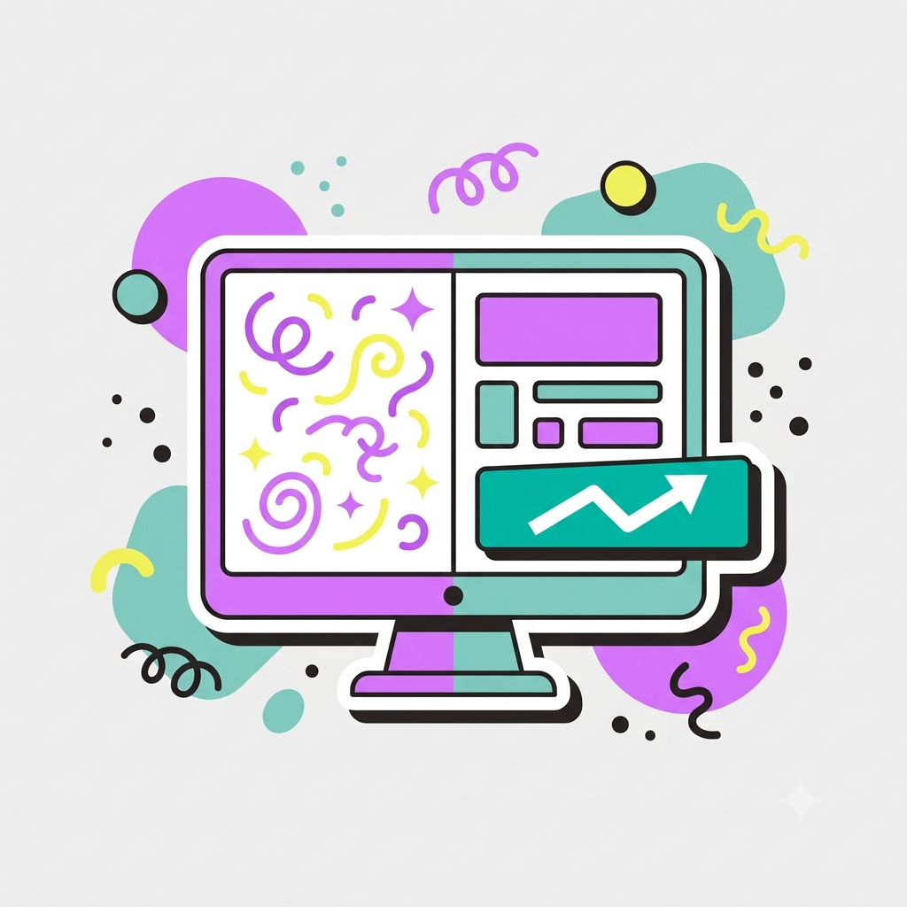
What A Website Design That Converts Actually Looks Like
A profitable website treats every element on screen as an employee with a specific sales job. It doesn’t just sit there looking good, it addresses customer objections, highlights your value, and maps a clear path to purchase.
To turn traffic into paying clients, your design needs three things:
- A crystal-clear headline: Visitors must understand exactly what you do within three seconds of landing on your page.
- Frictionless navigation: If someone has to hunt through five menus just to find your pricing, you’ve already lost them.
- Strategic visual hierarchy: Your most eye-catching elements should always be your testimonials, core benefits, and primary action buttons.
When these align, your website stops being a passive brochure and starts working as a 24/7 sales machine.
The Conversion Stack: Where Profitable Sites Win
Profitable websites rely on what actually works, not what looks cool. Every layout choice should be backed by how human beings actually consume information online. Research by HubSpot shows that structured layout patterns directly correlate with higher lead generation and lower bounce rates.
| Visual Component | The Pretty Approach | The Profitable Approach |
|---|---|---|
| Primary Buttons | Hidden pastel colors that blend into the background | High-contrast colors that immediately draw the eye |
| Headline Text | Vague, poetic phrases that sound clever but explain nothing | Direct, benefit-driven statements addressing customer problems |
| Images Used | Generic abstract shapes or disconnected stock photos | Real product screenshots, client faces, or tangible results |
If you want consistent revenue, trade clever design choices for clear ones.
Structuring Your Path to Purchase
Every profitable website acts like a guided tour. You can’t throw information at a visitor and hope they figure it out. You need a sequence that takes them from curious stranger to paying client.
- Hook the user: Place your strongest benefit right at the top of the page.
- Build immediate credibility: Display client logos or short reviews directly beneath your opening section.
- Agitate the problem: Remind the reader exactly what pain point they’re dealing with and why their current approach isn’t working.
- Present your offer: Introduce your service as the fix to that specific problem.
- Remove the risk: Use clear FAQs to address common hesitations around price, process, and timeline.
The Only Metrics That Actually Matter
Stop checking analytics just to look at traffic numbers or count compliments on your visuals.
The only numbers that define the health of your website are your conversion rate, average time on page, and revenue generated from your forms.
A simple, clean website design that converts 5% of its traffic will always beat a spectacular award-winning design that converts 0.5%. Aesthetics should serve your business goals, never the other way around.
The shift is simple. Stop asking “What looks cool?” Start asking “What helps my visitor make a buying decision?”
Once you make that switch, your website finally starts paying for itself.
If your website is getting traffic but not enquiries, something in the foundation is off. I offer a free audit where I take an honest look at what’s working and what isn’t. No pitch. Just clarity. Start at abdullahtallat.me